Skip to content

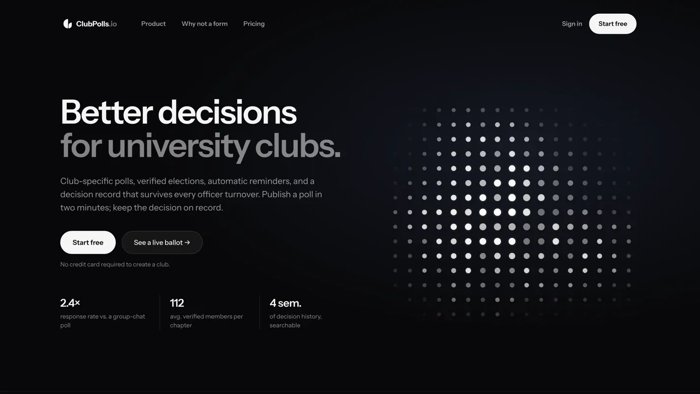
A decision platform for university clubs: polls, roster-gated elections, automatic reminders, and an archive of what was decided that survives the officers who decided it. Front end, back end and marketing site.

Under the hood 6 things worth opening

01 Two builds, split by job

The marketing site and the application are deliberately different things on different origins. clubpolls.io is a static Astro build; the product lives at dash.clubpolls.io as a Next.js App Router app on Cloudflare Workers via OpenNext. The point of the split is that someone reading the pitch never downloads a byte of the application — the demo route alone pulls roughly 176 KB of compressed JavaScript across nine chunks that the marketing homepage never touches.

02 The interactive parts run on no JavaScript at all

The officer-console tab switcher and the monthly/annual pricing toggle look like scripted components and aren't. Both are hidden radio inputs driving sibling selectors in CSS. The radios are clipped rather than hidden, so they stay focusable and the tab group inherits native arrow-key navigation — no roving-tabindex code to write, and nothing to go wrong when a script fails to load.

03 A canvas field with a power budget

The hero is a hand-written dot field, and most of the code in it exists to stop it costing anything. The animation frame is cancelled outright when the element scrolls out of view or the tab is hidden. Device pixel ratio is capped at 2. Easing is frame-rate independent and the delta clamped, so returning to a backgrounded tab doesn't produce a jump. The glow sprite is pre-rendered once to an offscreen canvas and only drawn for dots above an alpha threshold.

04 No raster images on the page

Zero img elements, zero picture elements, no video — the only vector on the page is the wordmark. What looks like a product screenshot is real markup, which is exactly why CSS can tab-switch between three views of it, why it costs no image bytes, and why it can never go stale against the product. Typography is self-hosted and split by unicode-range, so an English reader downloads two font files rather than four.

05 A same-origin content security policy

default-src 'self', with script-src enumerating a sha256 hash per inline script and no 'unsafe-inline' anywhere. The authored page references no external host but its own: no tag manager, no font CDN, no third-party analytics.

06 A public demo that shows its working

A demo route is readable without an account, and it's the one that exposes the maths: a ranked ballot, then the officer's side of it — a Borda count with the weighting stated in plain English, a consensus score, and a per-option polarization readout that tells you when a 'popular' option is actually splitting the room. The tally bars carry screen-reader labels rather than being decorative.

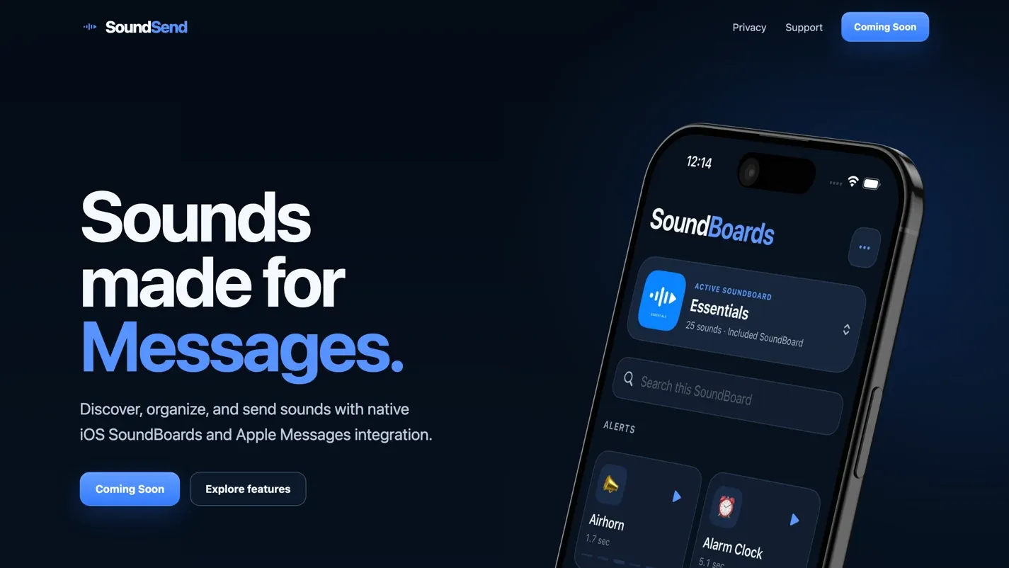
The pre-launch site for an iPhone app that organises short audio clips and sends them inside Messages. Eight pages whose job is explanation and App Store credibility — the app itself hadn't shipped when this was built.

Under the hood 5 things worth opening

01 About 1.3 KB of JavaScript, all of it hand-written

No framework runtime, and no first-party external script file on any page. The entire client-side behaviour is two inline modules — a navigation controller and a reveal observer — totalling roughly 1.3 KB of source between them.

02 Every enhancement gated behind a scripting flag

A 45-byte script in the head sets a data-js attribute before the stylesheet applies, and the CSS keys every JavaScript-dependent behaviour off it. Without scripting the hamburger is hidden and the navigation is permanently visible instead of collapsed; the scroll-reveal blocks are never made transparent in the first place. The failure mode is a completely readable page, not a blank one — which is the whole difference between progressive enhancement and hoping.

03 Fifty-three image variants from eight sources

The build generates a width ladder per image rather than one fixed asset. Every image carries a srcset, explicit width and height so layout space is reserved before it loads, and a multi-breakpoint sizes attribute — the hero declares four. The hero is eager and high priority; the other eleven are lazy.

04 A five-document legal library on one template

Privacy, terms, copyright, community guidelines and acceptable use — roughly 12,200 words — all render through a single layout. Each carries a cross-document sidebar marking the current page, and a per-document table of contents built as a native details element, so it expands and collapses with no JavaScript. Every heading has a slugified anchor, which means any individual clause can be linked to directly in a dispute.

05 Invented interface hidden from screen readers

Several sections contain hand-built mock app UI — a sound library listing 'Cat Meow · Personal Upload · 0.8 sec' and similar. Those containers are marked aria-hidden, so a screen reader isn't read fabricated sound names as though they were real content, while the genuine copy beside them stays exposed. Eight of the fourteen images are decorative and marked as such; none is missing an alt attribute.

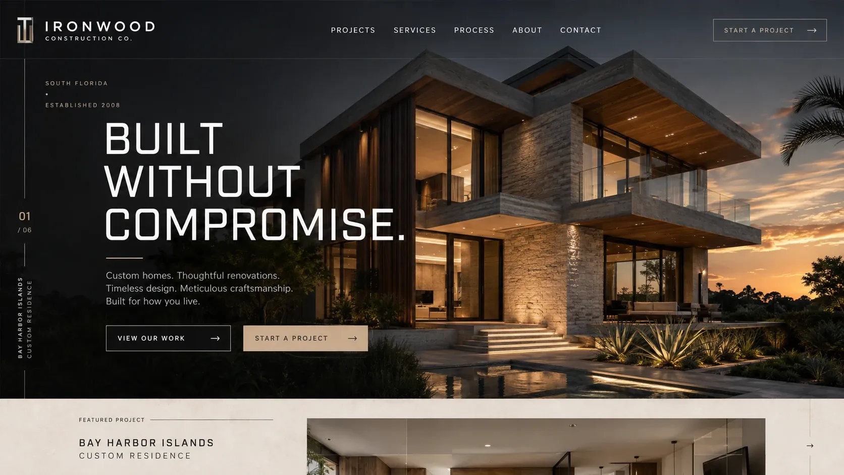
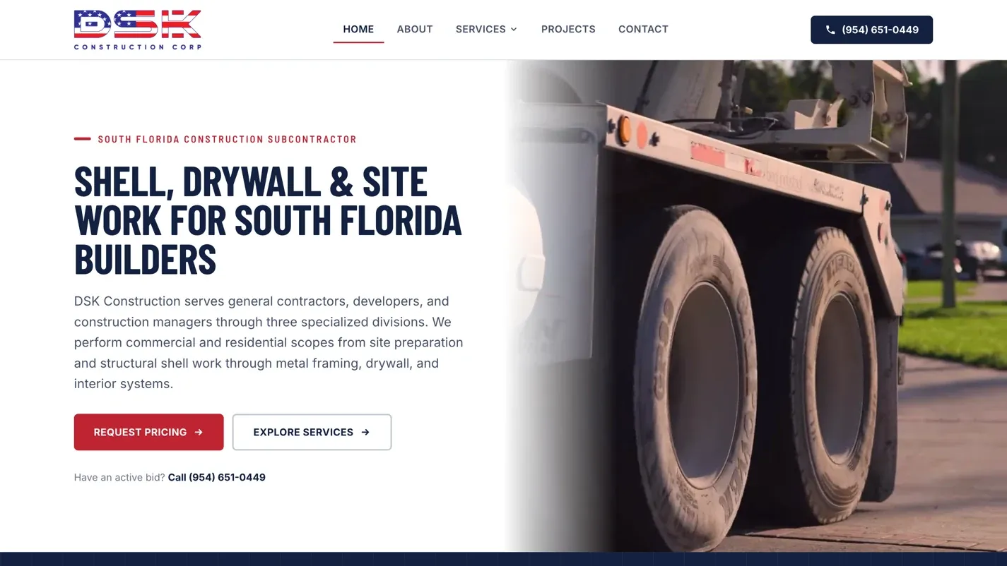
A South Florida subcontractor bidding across three divisions — shell, drywall, and equipment and site work. The site's real job isn't to look like a brochure; it's to get a general contractor to send a scoped bid request.

Under the hood 6 things worth opening

01 No JavaScript bundle ships at all

The only build asset on the entire site is one stylesheet. There is no generated script bundle anywhere in the markup. Every interactive behaviour is a hand-written inline module — the homepage carries five, totalling around 2.3 KB, covering the mobile menu, reduced-motion handling, the Instagram fetch, the FAQ fallback and scroll reveal.

02 A video scheduler that plays exactly one

The projects page watches four videos at four intersection thresholds, keeps a running map of how visible each one is, then plays only the most-visible video above a quarter on screen and pauses every other. Four videos never decode at once. If a play call is rejected by the browser's autoplay policy, that element switches to native controls rather than sitting there silently broken.

03 A native exclusive accordion, with a fallback

The FAQ uses the details element's name attribute — the modern HTML feature that gives one-open-at-a-time behaviour with no script at all. A 200-byte listener covers browsers that don't support it yet. The first item ships open, so the answer is visible and indexable on load rather than hidden behind a click.

04 An intake form modelled on the trade

Not a name-email-message box. A division selector, a bid due date as a real date field, project location, the general contractor's name, and a hidden field recording which page produced the lead. Spam control is a honeypot correctly hidden from assistive technology, and the result is announced through a live region rather than only appearing visually.

05 A social feed built to fail invisibly

The projects gallery is server-rendered with nine hand-picked photographs, each with alt text written for the actual image rather than derived from a filename. A script then attempts to replace them from the Instagram endpoint and bails out on any of five conditions — missing template, bad response, wrong shape, empty payload, thrown fetch. The visitor never sees a broken grid or a loading state that doesn't resolve; they see the curated gallery.

06 Structured data that can't drift from the page

Every page's FAQ schema carries exactly as many questions as there are FAQ elements rendered on it, with no drift on any page — the signature of schema generated from the same source as the markup rather than maintained alongside it by hand. The organisation node encodes the Florida contractor licence as a typed identifier rather than loose text.

One page, seven services, and a Broward County service area. Every route through it ends in a phone call — which is what this business actually wants, so nothing pretends otherwise.

Under the hood 5 things worth opening

01 A before-and-after slider you can drive from the keyboard

Built as a real slider control with proper value semantics, not a div that listens for mouse events. Dragging uses pointer capture; arrow keys step two percent, shift-arrows ten, home and end jump to the bounds. The reveal itself is pure CSS — the underlying photograph is counter-scaled against the clip width so it stays geometrically locked while only the mask moves, instead of sliding underneath.

02 A marquee that hides its own duplicate

The project strip loops seamlessly by cloning the whole sequence at runtime and animating to exactly the clone boundary. The clone is marked aria-hidden and every cloned image has its alt text emptied, so a screen reader reads twenty-five photographs once rather than fifty. That last part is the step most marquee implementations skip.

03 Custom scrolling that switches itself off

The smooth-scroll enhancement returns immediately unless three conditions all hold: no reduced-motion preference, a fine pointer with real hover, and a viewport wider than 767 pixels. Only then does it take over the wheel. It normalises the three delta modes, passes through ctrl and command so browser zoom still works, and cancels on any keypress. Hijacking scroll is usually a mistake; this one is fenced.

04 Local schema wired as a linked graph

The business is typed as both a local business and a construction business, with the service area expressed as properly typed administrative-area, place and city nodes rather than a string. Seven services are declared as offers, each carrying its own service area, and the site and page nodes cross-reference the business by identifier instead of repeating it three times.

05 A security policy, and a real 404

The site publishes a standards-compliant security.txt with contact, expiry, canonical, policy and acknowledgments fields — backed by pages that actually resolve, which is more than most. Unknown paths return a genuine 404 status rather than a soft 200 dressed up as an error page.

A Florida firm practising in three areas where the client is usually frightened and under-informed. The site is built around answering the questions that come before a phone call — at a depth most firm sites don't attempt.

Under the hood 6 things worth opening

01 278 questions carrying 340 citations

Four content files hold 278 answered questions across general, personal injury, veterans disability and workers' compensation. Between them the answers carry 340 outbound links to primary legal sources, rendered as labelled chips beneath each answer. A dedicated function normalises how each citation displays — stripping the boilerplate from a Florida Statutes reference while leaving C.F.R. and U.S.C. numbers intact — so a citation reads as a lawyer would write it rather than as a URL.

02 A content format that refuses to half-load

Content is authored in a bespoke plain-text format rather than a CMS. Each file declares its own item count in a header, and the parser slices the parsed result to that number — so a truncated file or a half-finished paste renders nothing rather than silently publishing a partial library. The declared count is the contract. Multi-paragraph answers survive intact, and every field is escaped before it reaches the page.

03 Search that ranks instead of filtering

A whole-phrase hit inside a question scores fourteen, inside an answer seven; individual terms score four and one. Results sort by score with original order as the tie-break. The 'all areas' view interleaves the four categories round-robin rather than concatenating them, so the first screen shows one question from each rather than sixty-two general ones before anything else appears.

04 Consent gated behind a valid phone number

The messaging-consent checkbox ships disabled and is only enabled once the phone field holds a real ten or eleven digit number; the submit button stays disabled until consent is actually given. The number reformats as it's typed. Three anti-spam measures run alongside — a screen-reader-only honeypot, a start timestamp for timing analysis, and a 32-character cryptographic nonce persisted for the session so it survives a page change.

05 Unfinished pages blocked accessibly, not hidden

Two routes are held behind a pre-launch gate driven by a data array. Every link pointing at them is marked aria-disabled, given a tooltip, and has both click and keyboard activation intercepted — so a keyboard user hits exactly the same wall as a mouse user rather than being navigated somewhere half-built. The placeholder card grid elsewhere is marked inert so it can't be tabbed into behind its overlay.

06 Testimonials packed by weight, rotated by stride

Nineteen clients are maintained in two parallel files — short excerpts for the homepage, full-length versions for the testimonials page — so the same quote appears at the right length in each context instead of being truncated mid-sentence. On the page, cards are distributed by greedy least-weight packing, each quote weighted by its length, which gives balanced columns rather than the ragged bottom a naive three-way split produces. The homepage rotator advances each of three slots by the slot count, so two slots can never land on the same quote.

We didn't redesign this site. We built three things into it: the booking platform, the gallery system, and the event-type selector on the front page.

A South and Central Florida DJ company that takes bookings online — pick an event type, build a package, see the price move, sign, and submit for approval before a deposit link is issued.

Under the hood 6 things worth opening

01 One pricing engine behind two surfaces

A single module owns the entire catalogue — nine event types, package tiers with hourly rates and minimum durations, and an eleven-item add-on catalogue with flat, per-unit and per-hour pricing — along with the billing rules and eligibility logic. Both the standalone calculator and the booking flow load that same module and share one saved draft. The estimate someone sees and the price attached to the request they submit are computed by the same code, because there is only one copy of it.

02 Answers become constraints, then a solved build

The optional planning questionnaire doesn't just get emailed over. Answers compile into a requirement profile — four microphones, outdoors, no power available — and the engine solves for the cheapest package and add-on combination that actually satisfies it, then explains itself in plain English when something no longer fits. Overriding is allowed rather than blocked: the interface offers keep-or-downgrade and records whether each choice came from the system or the customer.

03 A four-step flow that survives a reload

Forward movement is gated on validation rather than trusted — step three refuses to open without valid event details, step four without a base package. Buttons ship disabled in the HTML and unlock only when the configuration genuinely permits it. State persists as you go and clears on success, and a failed submission re-enables the button with all the customer's work still in place.

04 The contract is lifted from the page that governs it

The terms shown inside the booking flow aren't a second copy that can drift. They're fetched from the public terms page at runtime, parsed, and the relevant section injected — with the 'subject to change' line deliberately stripped, since it doesn't belong in a signing context. Editing the public page updates what customers sign. If the fetch fails it degrades to a link rather than showing an empty contract.

05 An event-type selector that carries the choice through

Nine event types are built from one array into real links styled as record sleeves, with the disc tucked behind and sliding out on interaction — triggered by hover, keyboard focus and focus-within alike, so keyboard users get the same reveal rather than nothing. Each routes to a service page that links onward into the booking flow and the calculator with the event type in the URL. Both read it, map it, clear any stale draft so the visitor starts clean, then strip the parameter back out. One package is deliberately excluded from the whole path: it's contact-only, so anyone arriving with it is redirected to contact rather than shown a price.

06 A gallery driven by a text file

Both gallery surfaces read a two-line configuration file that declares how many images and videos exist, and build the paths from it — so adding a photo means dropping in the next-numbered file and changing one number, with no redeploy and no CMS. Video tiles have their poster frames generated in the browser: the video is seeked a fraction of a second in, drawn to a canvas, and used as the thumbnail, with a timer in case it never becomes seekable. The gallery canvas itself is an adapted third-party template rather than our own engine — the work here is the config-driven catalogue and the media handling wired into it.

What isn't on this page

Before-and-after performance numbers. We're rebuilding the image pipelines on several of these sites, and until that's done and measured properly, quoting speed figures would mean quoting the ones that flatter us. When there are real numbers, they'll appear here with the methodology attached.

Testimonials, too. We'd rather you opened the six sites above and formed your own view than read six sentences we chose.

Want one of these for your business?

Tell us what you're working with. We'll come back with an honest read on whether you need a rebuild at all.